That Unique Uterus Look…
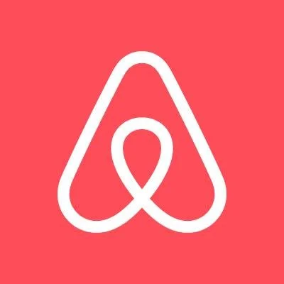
A little shy and very much conscious of the people around the office, my friend whispered “It looks like a uterus.” He shared in the popular consensus that the new Airbnb logo does in fact resemble certain body parts. Genitals in fact; junk, vagina, whatever your mind leaned towards.

A little shy and very much conscious of the people around the office, my friend whispered “It looks like a uterus.” He shared in the popular consensus that the new Airbnb logo does in fact resemble certain body parts. Genitals in fact; junk, vagina, whatever your mind leaned towards.
In response to this fiasco, and like many questionable brand adjustments before, people immediately wondered if Airbnb should change back. We should all recall Gap caving to the pressure and reverting after their tragic visual adjustment. Some are saying keep it, “Even with bad attention, it’s doing the job!”
It appears as though they intend to keep it, and I agree with that, but I have to call into question how the design got to this point. It’s so blatantly a birth canal, that it couldn’t have passed the dozens of desks and approval meetings without someone birthing some objections. The logo resembles testicles so much, I’m blown away nobody had the balls to question it. Yes, puns.
I watched the trailer about where the logo came from, and it’s a beautiful story that incorporates several elements of a larger brand. Cool, got it, but just do some user tests and see what people think. I can’t imagine Airbnb wanted to be known as the ovary logo company, even if it gets them more attention.
Perhaps we’ll never know if it was intentionally suggestive, or if it was just another branding company building in a vacuum. All I can say is that it gave them tremendous brand exposure and I’m actually considering using them. Well done Airbnb, your unique uterus look may have actually got a customer.
